Usage in 2D (UMG)
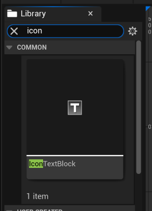
To use icons in a widget, you will use the IconTextBlock component.
First, make an IconTextBlock component
Once created, you will be presented with these options:
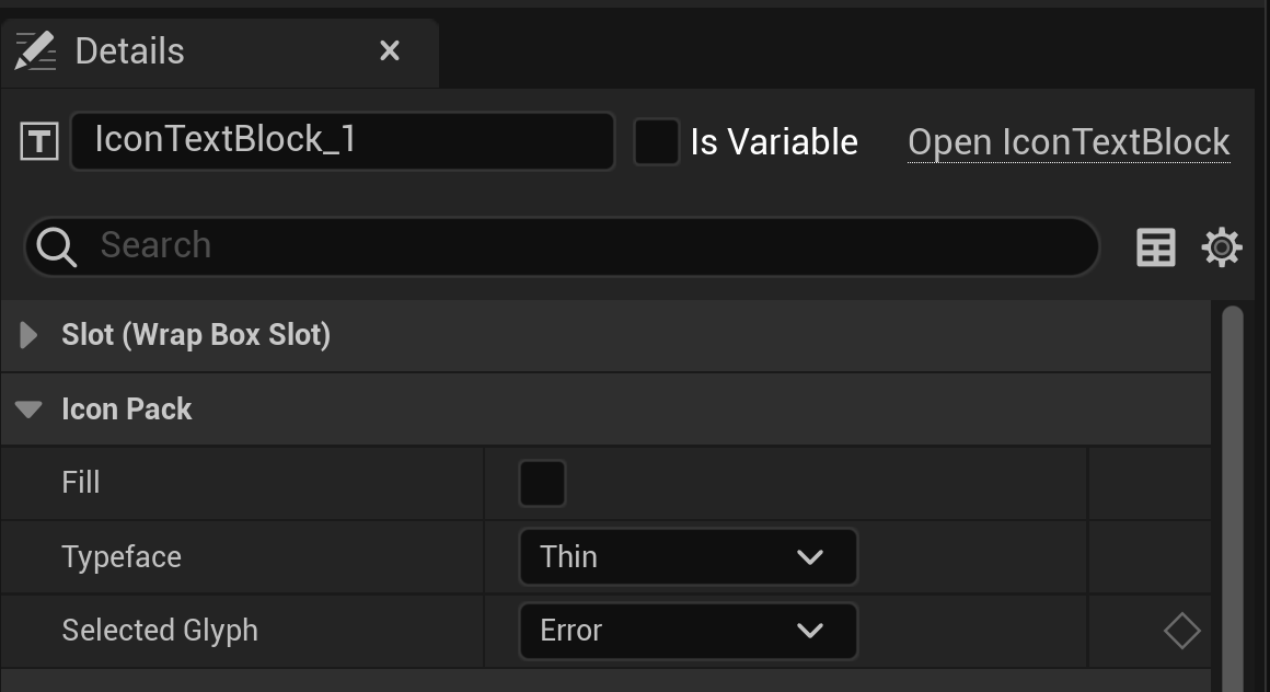
- Fill: Whether the icon should be filled in or not
- Typeface: The thickness of the icon
- Selected Glyph: The icon you want to use by name
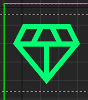
Example Usage
- Fill: No
- Typeface: Light
- Selected Glyph: Diamond